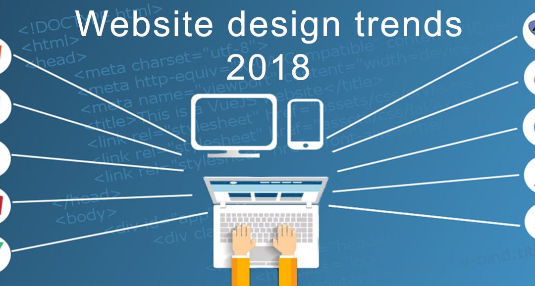
Website design trends are ever-changing landscapes for the last couple of years. It gave me a look into design trends that came and went, those that stuck around for some time and even those design trends that made miraculous comebacks. Based on these trends, I have made some observations. You can compare the below observation with our article on design trends expected in 2017.
Although these observations are not an attempt at making fancy predictions, this will be a consideration of current and new website design trends finding its way from other design fields into website design. The observations are:
Bright and/or bold fonts combined with minimalistic but engaging images.
The use of large bold fonts has been around for some time now and is not showing any sign of going anywhere. Combining these types of fonts with engaging photographic content helps to keep a website simple. With the advances in the capabilities of monitors and other device screens, colour saturation and brightness will ensure that simplicity does not equate to being boring.
Interactive websites.
Visitors to a website crave personalised and entertaining experiences. This is also the way in which they want to connect with brands. I am not referring to anything out of this world. Simple interactive content such as quizzes, games or polls will ensure such experiences. This is an example of how The Elephant Pants kicked off their humble beginnings by using a quiz titled “Which Pair of Elephant Pants Are You?”.
Illustrations and animations.
From our observations it is clear to us at WebScripto that illustrations and animations are used more and more on new and existing websites. Both animations and illustrations are visually pleasing and much more interesting than a long text description. As is the case with many website components there is no need for illustrations and animations to go overboard to the extent that it slows down your website significantly or becomes overwhelming. MamboMambo got it right in my opinion. They make good use of illustrative images with just a hint of animation. They make exceptional good use of the Ken Burns effect. The Ken Burns effect is simply where a still image or illustration is brought to life by a combination of panning and zooming effects.
Adventurous colours
Although bold colours have seen their share of entry into website design during 2016 and 2017, this will not slow down in 2018, according to James Bearne, creative director of Kagool,. “With new tools like Khroma helping us to find more interesting ways of using colour, it seems likely we’ll see more designers exploring how colour can be used to deliver exceptional experiences.”
“What will be interesting to see is how colour can be used alongside customisation and personalisation to create truly unique experiences for consumers that tick several boxes at once.”
Semi-flat design:
Flat design has been around for some time as well and although it is not dying down, it is slowly making way for semi-flat design. Semi-flat design (also known as flat design 2.0).
Where website designers avoided taboos such as colour, or grayscale gradients and shadows, they are now introduced in a moderated and disciplined way which gives a certain limited amount of depth and can be put to good use to determine the visual hierarchy of content on a specific website. You can have a look here to see an example.
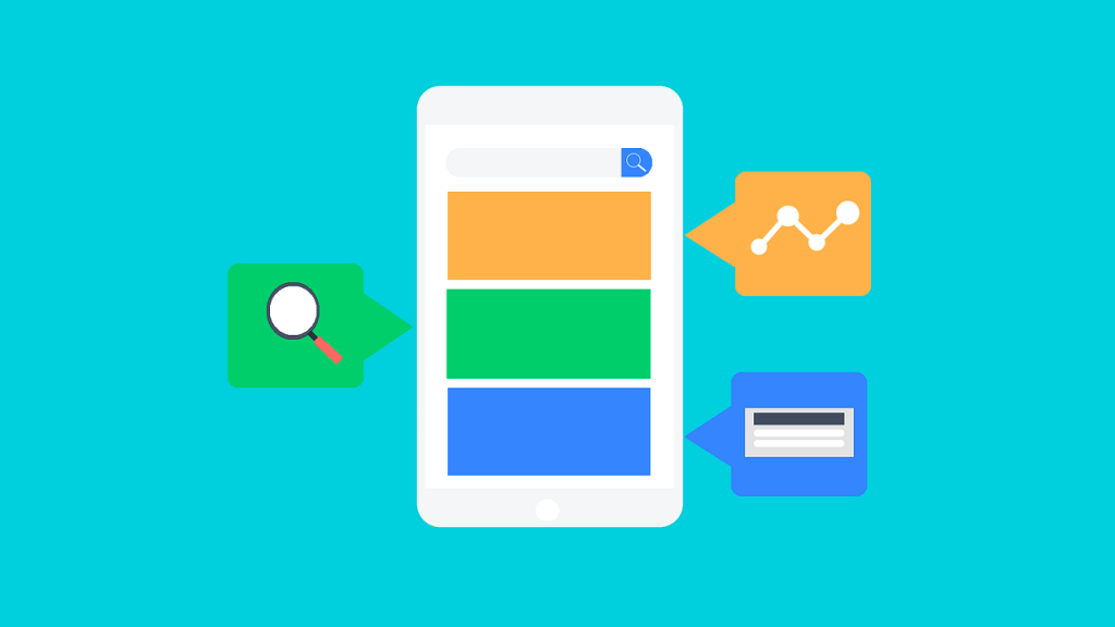
Designing for mobile:
Although designing for proper website display on mobile devices has been around for some time, its importance is only going to grow in 2018. During 2017 the mobile web usage has overtaken that of desktop browsing. I do not think much needs to be written on the importance of the “Mobile First” design approach. This simply means that when a website design is planned, it should be done in such a way that the website will also look good on a mobile device. It should actually be designed for mobile devices and also be able to render properly on a desktop device.
Asymmetrical Designs
The title may create the impression that a website design may lack balance as there will be no equality between the two halves of the design. This will however be a wrong assumption. With asymmetrical design, although the two sides of a website may differ from one another, the elements will be arranged in such a manner that there is a sense of balance.
So, while split screen designs were a huge trend in 2017, it is definitely going to continue to evolve into asymmetrical grid patterns as can be seen in the below example.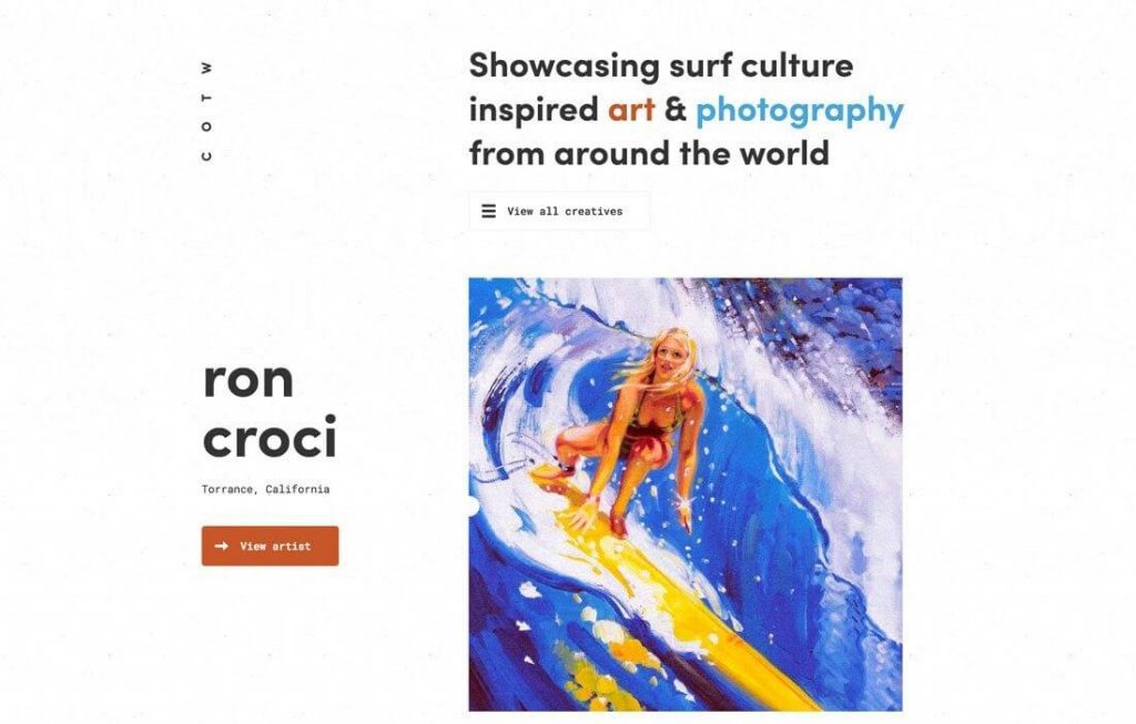
Kinetic Emails
Although technically not a website design trend, one cannot ignore the role that emails play alongside your website when it comes to marketing to, and communicating with your clients, potential clients and/or your target audience(s). Kinetic emails take using HTML and CSS in designing an email a bit further as they use CSS transitions and animations to deliver your key content in a marketing or any other type of campaign. An automatic sliding carousel is a good example of a Kinetic email. It can be taken further as an Kinetic Interactive email by including some elements that responds to user interaction such as has been illustrated here.
If anybody thought that emails were dead, I suggest that they reconsider their viewpoint.
Fluid shapes
When you have a good look at nature you will probably notice that there are very few (read – almost none) straight lines to be found. Whilst poly shapes such as rectangles, pentagons, hexagons etc have been used in website design for quite some time now, I believe that softer shapes which have a much more fluid look and with smoother lines, will noticeably find its way into designs. Whilst grids will still have its place in layouts, more fluid designs alongside asymmetrical layouts, will be the trend to follow.
Subtle Animations
With the emphasis on subtle, visitors to websites can expect small, simple, yet delightful animations that will surprise them. It is a well-known fact that animation can assist greatly in providing information by placing a certain degree of importance on specific areas of the website. We are not referring to animated gif images, but SEO rich content which is animated by using CSS.
We are also not referring to animated loading features, but actual movement within the website’s design itself. In order to keep these animations subtle, designers will have to select a specific type of animation such as a “fade in” transition. See this example
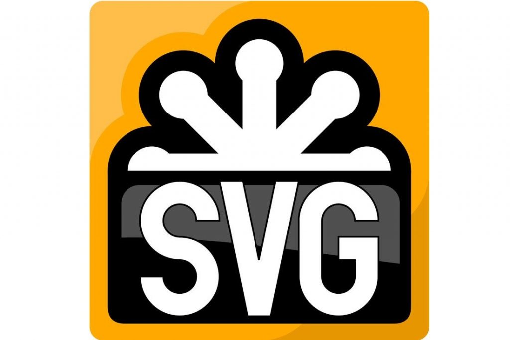
Scalable Vector Graphics
Scalable Vector Graphics, better known as SVG’s are becoming the more popular choice for website image types. It can actually be described as becoming the de facto image type for websites. SVG’s are different from png, ico, jpeg and other pixel based images. Pixel based images can become pixelated if they are displayed on large screens or if a page is enlarged for better viewing. Vector graphics do not have pixels and can be enlarged ad infinitum without showing any signs of degrading. On today’s ever-improving display resolutions SVG’s will be the first choice for graphic displays on websites. As photography is based on bitmap and is not compatible with the vector format, the above-mentioned will only apply to non-photographic images.
There are many other website design trends that could have been listed above. We have just listed the most obvious website design trends which we believe will be immediately noticeable on websites in 2018.
If you think we have overlooked an obvious website design trend for 2018, kindly let us know in the below comments section.
- How a Professional Website Can Boost Your Small Business - 13th September 2024
- 10 Must-Have Features for a Modern Business Website - 13th September 2024
- The Essential Role of a Website for Creators and Authors - 24th July 2024
The trends you have written are really true and would be helpful to web designers to enhance their knowledge. Appreciate your efforts to find out trends for web design. Thank you for sharing.
Thank you for reading and taking the time to comment Janet.
Rgs
Eitel