
1. A well planned colour scheme

2. Attention grabbing headline
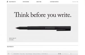
This is normally the first thing that catches your visitors’ eye. It should therefore be used in a very compelling way to set up the expectation of the visitor. It should tell the visitor what type of products and services and what kind of quality they can expect. It does not need to be complicated. Sometimes a very short but clear message will do the trick as in the below image.
This message is clear, concise and to the point.
3. Unique and Large Typography
The type of fonts you are using, and more importantly the combination thereof is extremely important. As can be seen in the above image, good use was made of a large font, that stands apart from the rest of the content. Unique fonts can be used by companies to help set them apart from their competition. There are many companies that are recognised by their unique fonts alone. See the well known Disney font below.
The choice of typography, not only on your website, but on your stationery etc. should give subtle hints as to what your company is all about, which can be serious, functional, informational, or fun.
![]()
4. Big responsive Hero Images
A hero image is a large banner image, prominently placed on a web page, generally in the front and center. The hero image is often the first visual a visitor encounters on the site and its purpose is to present an overview of the site’s most important content.
A good example of a hero image used on a website is by Madeo. The image covers the full screen of any device that is used to access their website because it is responsive. A responsive image adapts to any screen size. The image should be of such a nature that it tells the visitor exactly what the nature of the website is and set the tone for their visit.

5. Clearly defined “Call to Action”
A clearly defined “Call to Action” (CTA) is normally a clickable button or image that assists and tells visitors what to do on your website. If you sell products on an e-commerce website, for example, you can add a CTA that states “Click Here To View Our Latest Shoes”. It can also be used to get visitors to subscribe to a newsletter, make donations etc.
It is always a good idea to add your CTA as high as possible on your home or landing page. In the industry, it is referred to as placing the CTA “above the fold”. In simpler terms, it means adding the CTA in such a place on the page where it is immediately visible before any scrolling is required.

6. Properly chosen quality images
We have mentioned this in so many previous articles. It is however still one of the main reasons for the failing of a website. When choosing proper quality images the following should be considered:
- Will it assist visitors in visualising my products, or services and its benefits?
- Is the image relevant to my website/blog/online store?
- Are the images of a high standard and quality?
There are many websites that make use of poor quality images or website owners that simply does not want to spend money on quality images. Because people are visual creatures we use our eyes the most in evaluating an item. On a website an image (or video – see later) is often the only view a person will have of a specific product. Investing in quality images will definitely ensure a healthy Return On Investment (ROI).
7. Proper Sales Content (written copy)
The description of your products/services and its benefits is one of the key contributors to the success of your website and business. You should consider the fact that your written copy on your website will be the only communication you will have with most of your visitors or clients. For this reason, you need to make the most of the opportunity to “speak” to your visitors.
The copy needs to be enticing, explaining the benefits of your products and should guide or lead your visitors toward the purchase. Explain why a visitor should make use of your specific services or products.
8. A valuable “Opt-in Offer”
Although the majority of people, visiting your website, will not make a purchase during their first visit, it shows that they are curious about your products/services. Why not offer them something for free and obtain their email address in the process.
With an interesting newsletter, which they can subscribe to, or perhaps an unique free download, you may just be able to turn more visitors into customers. Sometimes, as can be seen in our example a challenge can skilfully be put to use as an “opt-in offer”.

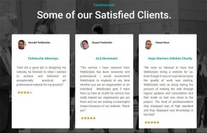
9. Client Testimonials
Testimonials are still the best way to establish and build credibility. It provides your visitors with evidence that your products/services are of a high quality. If your satisfied customer agrees, you should consider adding their image and the area they are staying in, to the testimonial. This will personalise their “evidence” and show that they are real people who benefited from your products/services.
If possible, these testimonials should be displayed on your homepage or landing pages, to establish your credibility as soon as possible with a visitor. This does not mean that you do not need a more detailed testimonial page.
10. “About us” Page
The “about us” page concept is almost as old as the first website ever created, yet it remains one of the best ways to introduce your company, your team and yourself to your visitors. Many people are very reluctant to purchase products on-line because they prefer the personal interaction of a “face to face” business.
Adding images of you and your team and giving a brief background of your business, will go a long way to put potential customers at ease.

11. Dedicated Frequently Asked Questions Page
It is great to have a dedicated page where you can list the questions visitors to your website ask most often. By answering the questions in this manner, it allows your visitors to have immediate answers to their questions. This is very important if they have questions about your products or services prior to buying it from you.
12. Company’s Contact Information
A sale on your website constitutes a transaction, just as with any other transaction in a physical store. For this reason, your on-line business’ full contact information should be displayed on your website. This will include your mailing address as well as your fax number, telephone number and email addresses. Not only will it come across as unprofessional if you only display your email address, but it will instill doubt in the mind of possible clients. Click here for a great example of a company’s contact details displayed on their “contact us” page.
13. Card Design Layouts
The idea behind card design layouts, as can be seen on Pinterest, is to furnish your website’s visitors with smaller bite-sized pieces of information. Not only is this visually pleasing, it also makes it easier for a visitor to immediately concentrate on what he/she is actually looking for. There are few things less frustrating than having to comb through oodles of large content to eventually get to what you are actually looking for. In today’s world, there is simply no place for tons of text. For mobile devices where data can be costly, it makes absolute sense to have your content displayed in this manner.

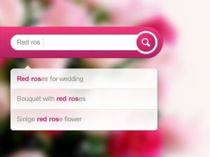
14. Search Functionality
This is an often overlooked but extremely important part of a website. More so when your website has been up for a couple of years and many of your content such as articles, product reviews etc. are being kept in an archive. When articles, reviews etc. are stored in your website’s archives they are normally not visible. It goes without saying that your visitor can only see what is visible on your pages. Let’s assume your visitor is interested in a specific topic, finds your content interesting, but would like to get more information. Instead of this visitor having to leave your website to get more information it would be great if a simple search on your website could reveal more information currently stored in the website’s archives.
Since not all the available information on your website will be immediately visible, an unobtrusive search box is a must have.
15. Short Products or Featured Videos.
It is now becoming more and more possible to reduce video sizes for proper display on websites. By using this feature to highlight specific products or features of your website, you will go a very long way to bringing it to life. Short video clips can be engaging and is a fantastic way to illustrate not only your products and services, but also their quality and how it can be used.
As has been mentioned so many times, many independent studies have proven that humans prefer visual stimuli when purchasing a product or service. Videos do not necessarily have to be hosted on your website or server. Youtube, Vimeo and other services, will allow you to host your videos on their servers and add a link to it on your website. There is really no reason why you should not make use of videos, whether it is an actual product or animation. Click here for a great example.
We trust that you have enjoyed the article and that you may find it useful when considering a new website. Should you have any questions you are welcome to contact us at our Pretoria Website Design Studio or leave a comment below.
Until next time, take care.

Eitel Bock
WebScripto Pty Ltd
- How a Professional Website Can Boost Your Small Business - 13th September 2024
- 10 Must-Have Features for a Modern Business Website - 13th September 2024
- The Essential Role of a Website for Creators and Authors - 24th July 2024